
This Excel tutorial explains how to ordinal data (text) in scatter chart using bar chart.
Excel scatter chart using text name
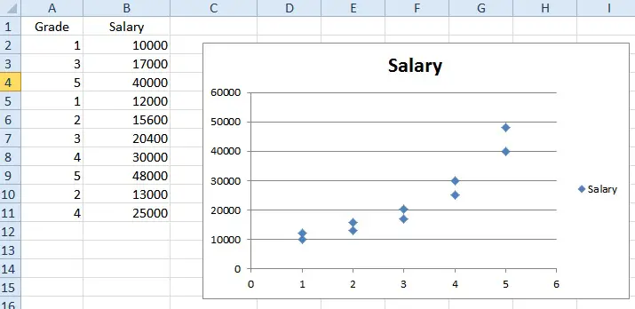
Excel scatter chart requires the x axis and y axis for each data point to be plotted in a diagram, and then join all those point together to analyze the trend or analyze if x and y variables are correlated, where X and Y values have to be numeric values.
Below is an example showing how employee Grade is related to salary. From the graph, you can see the trend that Salary increases exponentially with Grade (although the data is dummy, the trend is real).
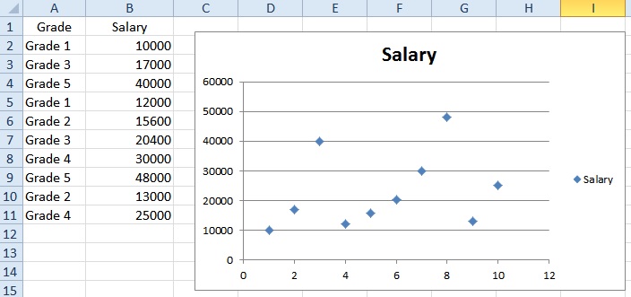
Sometimes we categorize x axis values as a group name (ordinal data) instead of providing the actual numeric value.
If we put text name in x axis (Grade), in order to force text name to become numeric, Excel converts first x value (Grade 1) to numeric value 1, the 2nd x value (Grade 3) to numeric value 2, and so on. Therefore in the below scattered chart, we see 10 data points.
Solution – Excel scatter chart using text name
To group Grade text (ordinal data), prepare two tables:
1) Data source table
2) a mapping table indicating the desired order in X-axis
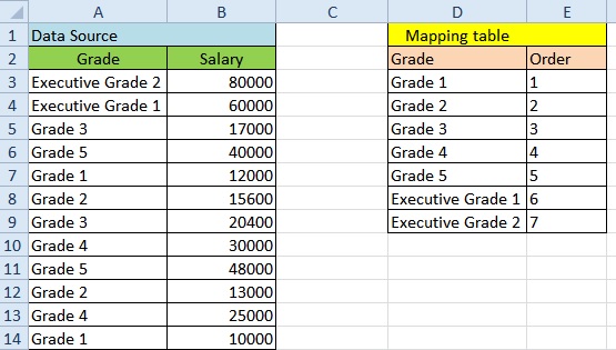
In Data Source table, vlookup up “Order” from “Mapping Table”, we are going to use this Order value as x-axis value instead of using Grade.
In Mapping table, put a dummy 0 for Y axis.
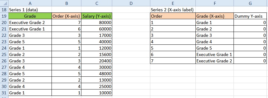
Since Excel allows different chart types to be displayed in one chart, we are going to create a mix of bar chart (column chart) and scatter chart.
Scatter chart is used to display the actual data point, while bar chart is to display Grade labels.
– Create scatter chart for Range B20:C31 (Series 1)
– Add bar chart (column chart) for Range F20:G26 (Series 2)
Due to 0 y axis for Series 2, no value is displayed, only the x-axis label can be seen.
The outcome should look like below.

Alternatively, you can also create a another scattered graph for Series 2, then show x-value as label. However more steps are required.
Outbound References
http://superuser.com/questions/646759/scatter-chart-with-one-text-non-numerical-axis