
This Excel tutorial explains how to use clustered column chart to compare a group of bar charts.
Excel clustered column chart
Clustered column chart is very similar to bar chart, except that clustered column chart allow grouping of bars for side by side comparison. This tutorial demonstrates how to build clustered column chart.
Example – clustered column chart
Suppose we want to build a sales bar chart for Q1 to Q4 in 2015. We can simply build a bar chart that shows sales of each quarter in each bar. But what if we also want to compare the sales in 2014 for each quarter (year over year comparison) ?
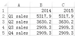
Now create a matrix as below
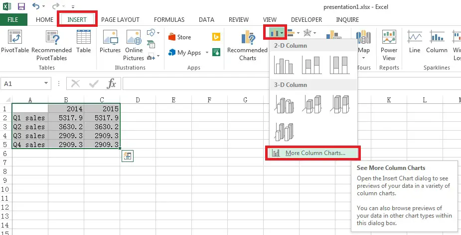
In Excel 2013, select data from A1 to C5, > Insert > Insert Column Chart > More Column Charts
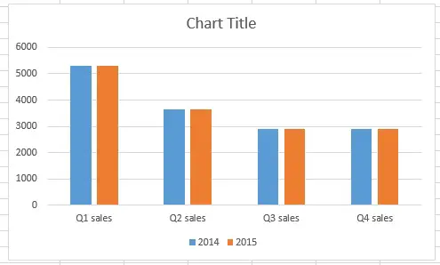
Under Clustered Column, there are two options as below. One is x-axis grouped by year, and the other is grouped by quarter.

In this example, we want to compare each quarter side by side, so we choose the first option.
Modify clustered column chart
Although we have completed the graph, we also want to know how to modify the graph parameter.
Now right click on the graph and click on Select Data
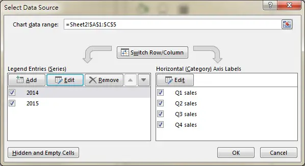
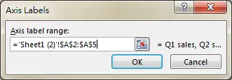
On the right hand side Horizontal Axis Labels, we can modify the X axis Labels by clicking on Edit button. In our example, we select Range A2:A5 in order to show Q1 sales to Q4 sales labels.
On the left hand side Legend Entries, 2014 and 2015 represent the y axis value of the bars, they are two sets of data so we need to add two entries (2014 and 2015) if we manually select the data.
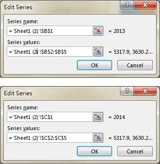
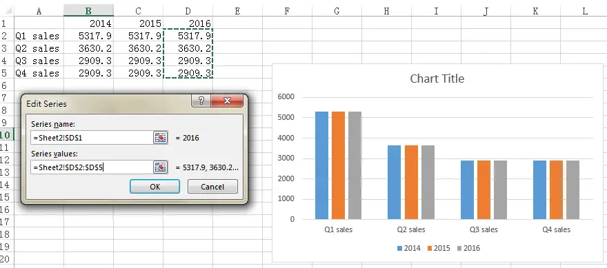
Assume that we have 2016 data in column D and we want to add it to the existing graph.
Click on Add button, and then fill in the Edit Series box as below.
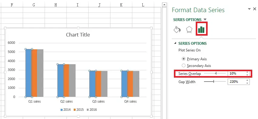
Format clustered column chart
Most formatting are self explanatory, but one notable option is Series Overlap, you can adjust it to prevent the gap between each bar within the same group.
Outbound References
http://www.ehow.com/how_8500994_create-clustered-stacked-chart-excel.html
