
This Excel tutorial explains how to create Excel Histogram.
You may also want to read:
Excel scatter chart using text name
Definition of Histogram
Before reading this post, you are recommended to read my below post.
Types of data in statistics (Interval, Nominal, Ordinal).
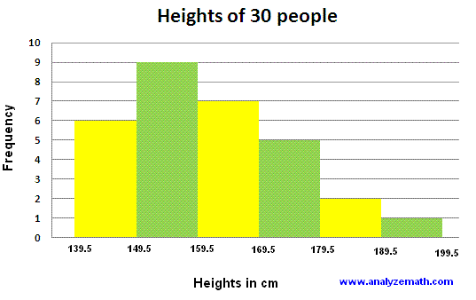
Histogram is a column chart that counts frequency of numbers and categorize the numbers into numerical groups (the groups are called bins). Usually people don’t leave space between two bars because numbers are continuous, however you can still do it with space.
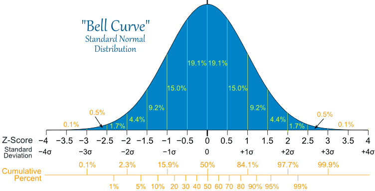
One of the great use of histogram is to check whether the data is normally distributed (whether histogram can form a bell-shape), because most statistics analysis such as T-Test, Chi-Square etc require the data to be normal.
Histogram is different from Bar Chart in the way that Bar Chart groups data into nominal groups. For example, when you count the frequency of color, the color name is nominal data but not a continuous number.
Note that the below example is a bar chart but not a Histogram, since it is summing up the sales, not counting the frequency of year.

Create Excel Histogram
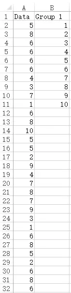
First, prepare a data set that are numeric values. For example, input in column A a list of random number between 1 to 10.
Second, prepare a list of grouping for the number (known as bins). The grouping must not be duplicated.
Lets try to use 1 to 10 as the grouping, meaning each number will display as one bar in Excel Histogram.
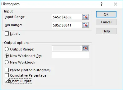
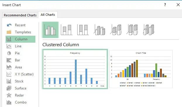
In Excel 2013, navigate to Data tab > Data Analysis > Histogram
If you cannot see Data Analysis, click here

Input the Input Range, Bin Range, and most importantly check the box of Chart Output box in order to generate the Histogram.
Now frequency table and Histogram are generated.
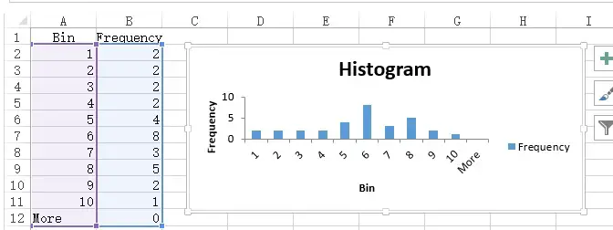
When you right click on the Histogram > Select Data Source, you will notice that the Excel Histogram is not using the original data source to plot the Excel Histogram, it is in fact using the data in the newly generated A2:B12 frequency table. The Histogram is in fact a standard Clustered Column Chart, the difference is that Excel prepares the frequency table for you if you choose Histogram, saving you some time to count the data.
Create Excel Histogram with bin range
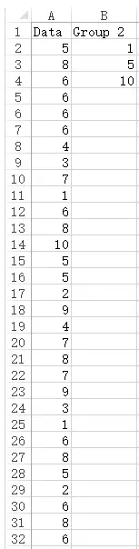
In the above example, I have 10 bars for number 1 to 10. Now I will try to group number 1 to 10 into 3 bars.
In the below table, column B is the grouping I want to make for data in column A. It is extremely confusing how to group all data into 3 numbers, we will explain that soon.
As we generate the Excel Histogram, we can see there are only three bars. The data are grouped as follows:
Bin 1 counts data<=1 (including negative number)
Bin 5 counts data>1 and <=5
Bin 10 counts data>5 and <=10
More counts data >10
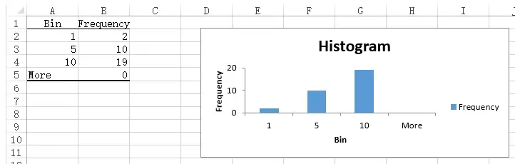
Because the horizontal label is referring to A2:A4, you can simply change the value in A2:A4 to whatever label you want, the label will reflect immediately in the Excel Histogram.

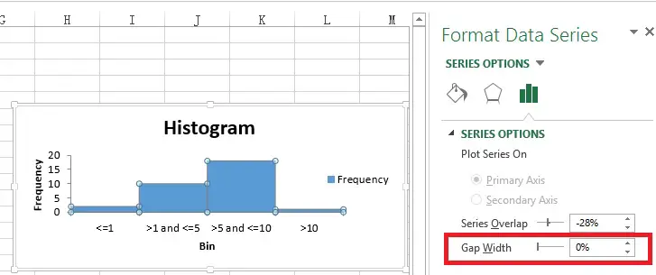
You can also click on the Histogram and adjust the Gap Width to 0% to make it more like a Histogram (since some people think Histogram must have no gap while Bar Chart must have gap).
Outbound References
https://support.office.com/en-us/article/Create-a-histogram-B6814E9E-5860-4113-BA51-E3A1B9EE1BBE